Demographic change
Old-age pensions in Switzerland are funded in part on a so-called pay as you go basis. The special feature of this system is that the pension contributions paid in are passed on directly to the pensioners month by month. In other words rather than being saved, the money is paid out immediately – hence ‘as you go’.
The following table illustrates the development of the number of people of working age in relation to the number of pensioners in Switzerland for the years 1970, 2020 and 2050 (forecast).
Study the table carefully before solving tasks a) and b).
Illustrative example: In 1970, there were five working people for each pensioner.
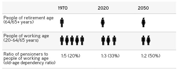
Source(s): Iconomix, based on the Swiss Federal Statistical Office (2020). Ratio of pensioners to gainfully employed persons and scenarios for development of the population in Switzerland
Add the correct years to the statements and fill in the missing figures for the statements.
: The highest number of people of working age per pensioner, namely
: people of working age per pensioner
: The lowest number of people of working age per pensioner, namely
What are the consequences of the trend in the ratio of working-age people to pensioners?
Tick the appropriate boxes.
The following chart shows the trend in the permanent resident population (staying at least 12 months; Source(s): SFSO, Population) in Switzerland since 1860.
Illustrative example: In 1930, approximately four million people lived in Switzerland.
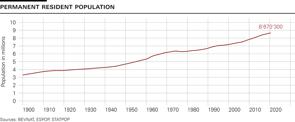
How did the permanent resident population in Switzerland develop between 1940 and 2010?
Tick the appropriate boxes.
What could the reasons be for the increase in the permanent resident population over this period? Formulate your own hypothesis (three to four sentences).
The following chart shows the number of live births per year in Switzerland between 1900 and 2020.
Illustrative example: In 2012, just over 80,000 babies were born in Switzerland.
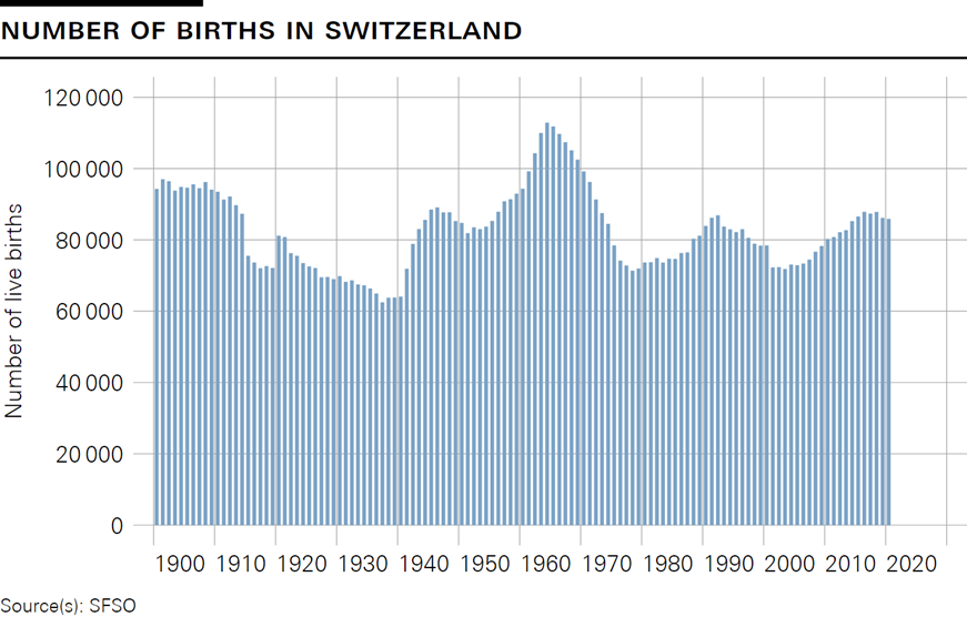
How did the number of births in Switzerland develop between 1940 and 1970?
Explain in a few sentences.
Looking at the whole period, which year had the highest number of births?
Which year had the lowest?
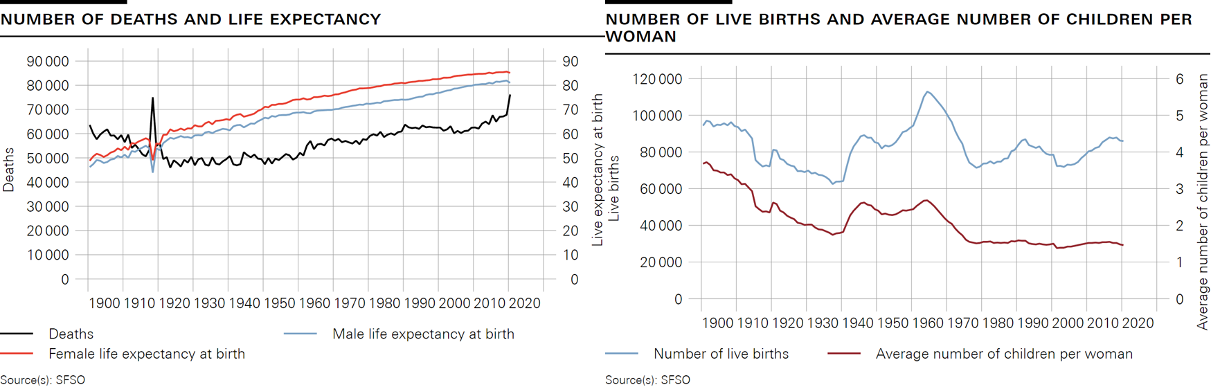
The chart on the left shows the number of deaths (lhs) and the life expectancy of males and females at birth (rhs).
The chart on the right shows the number of live births (lhs) and the average number of children per woman (rhs).
Illustrative example: The life expectancy of a girl born in 1984 is about 80 years. Some 60,000 people died in Switzerland in the same year. In 1970, the average number of children per woman was 2.0 and some 100,000 children were born.
Tick the appropriate box. Explain your decision each time on the basis of the chart.
How many children did one woman have on average in 2020?
A flu epidemic (Spanish flu) hit Switzerland in 1918/1919 and claimed the lives of almost 25,000 people. One peculiarity of the Spanish flu was that the deaths it caused were primarily in the age range of 20 to 40 year-olds. How is this event visible in the chart showing the number of deaths and life expectancy?
In 2020, Switzerland was hit by another global pandemic: coronavirus, also known as COVID-19. However, in the chart showing the number of deaths and life expectancy, this event is not as visible as the Spanish flu. Although the number of deaths also rose sharply, life expectancy only fell by about half a year for women and about one year for men (compared with 9 years for both men and women in the case of the Spanish flu). What could be the reasons for the difference in the effect on life expectancy of COVID-19 compared with Spanish flu? Answer in one or two sentences.
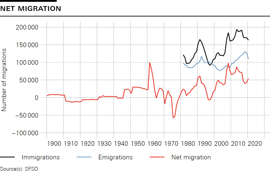
Net migration is defined as the difference between the number of people moving into a country (immigrants) and the number of people moving out of that country (emigrants). The following chart shows net migration and the number of immigrants and emigrants in a particular year.
Illustrative example: In 2000, some 110,000 people moved into Switzerland and some 90,000 people moved out of Switzerland. This gives a net migration rate of some 20,000 people.
Fill in the gaps with the following terms:
higher, lower, positive, negative, rising, falling, more, less, increase, decrease, net migration, immigration, emigration.
Note: You do not need to use every word.
The difference between the number of immigrants and the number of emigrants is termed . Since 1980 net migration has been largely . Just before 1980 it was . This means that people moved away from Switzerland than moved to the country. Net migration was in 2015 than in 2000. The sharp rise in has been the main reason for the in net migration over the last ten years.
Net migration has fluctuated considerably over the last 100 years. Why do people emigrate?
Give at least two reasons.
Look at the following table. On the left you can see a change in a demographic factor (e.g. increase in life expectancy).
For each of the changes on the left, decide whether the number of people of working age per pensioner rises or falls.
